Notes Bootstrap
Breakpoints
| Breakpoint | Class Infix | Dimensions |
|---|---|---|
| Extra small | None | < 576px |
| Small | sm | ≥ 576px |
| Medium | md | ≥ 768px |
| Large | lg | ≥ 992px |
| Extra Large | xl | ≥ 1200px |
| Extra Extra Large | xxl | ≥ 1400px |
// X-SMALL DEVICES (PORTRAIT PHONES, LESS THAN 576px) // NO MEDIA QUERY FOR 'xs' SINCE THIS IS THE DEFAULT IN BOOTSTRAP // SMALL DEVICES (LANDSCAPE PHONES, 576px AND UP) @media (min-width: 576px) { ... } // MEDIUM DEVICES (TABLETS, 768px AND UP) @media (min-width: 768px) { ... } // LARGE DEVICES (DESKTOPS, 992px AND UP) @media (min-width: 992px) { ... } // X-LARGE DEVICES (LARGE DESKTOPS, 1200px AND UP) @media (min-width: 1200px) { ... } // XX-LARGE DEVICES (LARGER DESKTOPS, 1400px AND UP) @media (min-width: 1400px) { ... }
These breakpoints are customizable via Sass, you'll find them in a Sass map in the _variables.scss stylesheet.
$grid-breakpoints: ( xs: 0, sm: 576px, md: 768px, lg: 992px, xl: 1200px, xxl: 1400px );
Containers
| Extra Small <576px |
Small ≥576px |
Medium ≥768px |
Large ≥992px |
X-Large ≥1200px |
XX-Large ≥1400px |
|
|---|---|---|---|---|---|---|
| .container | 100% | 540px | 720px | 960px | 1140px | 1320px |
| .container-sm | 100% | 540px | 720px | 960px | 1140px | 1320px |
| .container-md | 100% | 100% | 720px | 960px | 1140px | 1320px |
| .container-lg | 100% | 100% | 100% | 960px | 1140px | 1320px |
| .container-xl | 100% | 100% | 100% | 100% | 1140px | 1320px |
| .container-xxl | 100% | 100% | 100% | 100% | 100% | 1320px |
| .container-fluid | 100% | 100% | 100% | 100% | 100% | 100% |
Background
Standard
With Gradients
Variables
Most background-color utilities are generated by our theme colors, reassigned from our generic color palette variables.
$blue: #0d6efd; $indigo: #6610f2; $purple: #6f42c1; $pink: #d63384; $red: #dc3545; $orange: #fd7e14; $yellow: #ffc107; $green: #198754; $teal: #20c997; $cyan: #0dcaf0;
$primary: $blue; $secondary: $gray-600; $success: $green; $info: $cyan; $warning: $yellow; $danger: $red; $light: $gray-100; $dark: $gray-900;
$gradient: linear-gradient(180deg, rgba($white, .15), rgba($white, 0));
Grayscale colors are also available, but only a subset are used to generate any utilities.
$white: #fff; $gray-100: #f8f9fa; $gray-200: #e9ecef; $gray-300: #dee2e6; $gray-400: #ced4da; $gray-500: #adb5bd; $gray-600: #6c757d; $gray-700: #495057; $gray-800: #343a40; $gray-900: #212529; $black: #000;
Map
Theme colors are then put into a Sass map so we can loop over them to generate our utilities, component modifiers, and more.
$theme-colors: ( "primary": $primary, "secondary": $secondary, "success": $success, "info": $info, "warning": $warning, "danger": $danger, "light": $light, "dark": $dark );
Grayscale colors are also available as a Sass map. This map is not used to generate any utilities.
$grays: ( "100": $gray-100, "200": $gray-200, "300": $gray-300, "400": $gray-400, "500": $gray-500, "600": $gray-600, "700": $gray-700, "800": $gray-800, "900": $gray-900 );
Mixins
No mixins are used to generate our background utilities, but we do have some additional mixins for other situations where you'd like to create your own gradients.
@mixin gradient-bg($color: null) { background-color: $color; @if $enable-gradients { background-image: var(--#{$variable-prefix}gradient); } }
// Horizontal gradient, from left to right // // Creates two color stops, start and end, by specifying a color and position for each color stop. @mixin gradient-x($start-color: $gray-700, $end-color: $gray-800, $start-percent: 0%, $end-percent: 100%) { background-image: linear-gradient(to right, $start-color $start-percent, $end-color $end-percent); } // Vertical gradient, from top to bottom // // Creates two color stops, start and end, by specifying a color and position for each color stop. @mixin gradient-y($start-color: $gray-700, $end-color: $gray-800, $start-percent: null, $end-percent: null) { background-image: linear-gradient(to bottom, $start-color $start-percent, $end-color $end-percent); } @mixin gradient-directional($start-color: $gray-700, $end-color: $gray-800, $deg: 45deg) { background-image: linear-gradient($deg, $start-color, $end-color); } @mixin gradient-x-three-colors($start-color: $blue, $mid-color: $purple, $color-stop: 50%, $end-color: $red) { background-image: linear-gradient(to right, $start-color, $mid-color $color-stop, $end-color); } @mixin gradient-y-three-colors($start-color: $blue, $mid-color: $purple, $color-stop: 50%, $end-color: $red) { background-image: linear-gradient($start-color, $mid-color $color-stop, $end-color); } @mixin gradient-radial($inner-color: $gray-700, $outer-color: $gray-800) { background-image: radial-gradient(circle, $inner-color, $outer-color); } @mixin gradient-striped($color: rgba($white, .15), $angle: 45deg) { background-image: linear-gradient($angle, $color 25%, transparent 25%, transparent 50%, $color 50%, $color 75%, transparent 75%, transparent); }
Utilities API
Background utilities are declared in our utilities API in scss/_utilities.scss. Learn how to use the utilities API.
"background-color": ( property: background-color, class: bg, values: map-merge( $theme-colors, ( "body": $body-bg, "white": $white, "transparent": transparent ) ) ),
Borders
Use border utilities to quickly style the border and border-radius of an element. Great for images, buttons, or any other element.
Additive
<span class="border_blocks border-3 border"></span> <span class="border_blocks border-3 border-top"></span> <span class="border_blocks border-3 border-end"></span> <span class="border_blocks border-3 border-bottom"></span> <span class="border_blocks border-3 border-start"></span><br/>
Subtractive
<span class="border_blocks border-0"></span> <span class="border_blocks border-top-0"></span> <span class="border_blocks border-end-0"></span> <span class="border_blocks border-bottom-0"></span> <span class="border_blocks border-start-0"></span>
Border Color
<span class="border_blocks border border-primary"></span> <span class="border_blocks border border-secondary"></span> <span class="border_blocks border border-success"></span> <span class="border_blocks border border-danger"></span> <span class="border_blocks border border-warning"></span> <span class="border_blocks border border-info"></span> <span class="border_blocks border border-light"></span> <span class="border_blocks border border-dark"></span> <span class="border_blocks border border-white"></span>
Border Width
<span class="border_blocks border border-1"></span> <span class="border_blocks border border-2"></span> <span class="border_blocks border border-3"></span> <span class="border_blocks border border-4"></span> <span class="border_blocks border border-5"></span>
Border Radius
<span class="border_blocks border rounded border-4"></span> <span class="border_blocks border rounded-top border-4"></span> <span class="border_blocks border rounded-end border-4"></span> <span class="border_blocks border rounded-bottom border-4"></span> <span class="border_blocks border rounded-start border-4"></span> <span class="border_blocks border rounded-circle border-4"></span> <span class="border_blocks border rounded-pill border-4"></span>
Amount Of Round
<span class="border_blocks border border-4 rounded-0"></span> <span class="border_blocks border border-4 rounded-1"></span> <span class="border_blocks border border-4 rounded-2"></span> <span class="border_blocks border border-4 rounded-3"></span>
SASS
Variables
$border-width: 1px; $border-widths: ( 1: 1px, 2: 2px, 3: 3px, 4: 4px, 5: 5px ); $border-color: $gray-300; $border-radius: .25rem; $border-radius-sm: .2rem; $border-radius-lg: .3rem; $border-radius-pill: 50rem;
Mixins
@mixin border-radius($radius: $border-radius, $fallback-border-radius: false) { @if $enable-rounded { border-radius: valid-radius($radius); } @else if $fallback-border-radius != false { border-radius: $fallback-border-radius; } } @mixin border-top-radius($radius: $border-radius) { @if $enable-rounded { border-top-left-radius: valid-radius($radius); border-top-right-radius: valid-radius($radius); } } @mixin border-end-radius($radius: $border-radius) { @if $enable-rounded { border-top-right-radius: valid-radius($radius); border-bottom-right-radius: valid-radius($radius); } } @mixin border-bottom-radius($radius: $border-radius) { @if $enable-rounded { border-bottom-right-radius: valid-radius($radius); border-bottom-left-radius: valid-radius($radius); } } @mixin border-start-radius($radius: $border-radius) { @if $enable-rounded { border-top-left-radius: valid-radius($radius); border-bottom-left-radius: valid-radius($radius); } } @mixin border-top-start-radius($radius: $border-radius) { @if $enable-rounded { border-top-left-radius: valid-radius($radius); } } @mixin border-top-end-radius($radius: $border-radius) { @if $enable-rounded { border-top-right-radius: valid-radius($radius); } } @mixin border-bottom-end-radius($radius: $border-radius) { @if $enable-rounded { border-bottom-right-radius: valid-radius($radius); } } @mixin border-bottom-start-radius($radius: $border-radius) { @if $enable-rounded { border-bottom-left-radius: valid-radius($radius); } }
Colors
Convey meaning through color with a handful of color utility classes. Includes support for styling links with hover states, too.
.text-primary
.text-secondary
.text-success
.text-danger
.text-warning .bg-dark
.text-info .bg-dark
.text-light .bg-dark
.text-dark
.text-body
.text-muted
.text-white .bg-dark
.text-black-50
.text-white-50 .bg-dark
Deprecation: With the addition of .text-opacity-* utilities and CSS variables for text utilities, .text-black-50 and .text-white-50 are deprecated as of v5.1.0. They'll be removed in v6.0.0.
Opacity
Added in v5.1.0
As of v5.1.0, text color utilities are generated with Sass using CSS variables. This allows for real-time color changes without compilation and dynamic alpha transparency changes.
How It Works
Consider our default .text-primary utility.
.text-primary { --bs-text-opacity: 1; color: rgba(var(--bs-primary-rgb), var(--bs-text-opacity)) !important; }
We use an RGB version of our --bs-primary (with the value of 13, 110, 253) CSS variable and attached a second CSS variable, --bs-text-opacity, for the alpha transparency (with a default value 1 thanks to a local CSS variable). That means anytime you use .text-primary now, your computed color value is rgba(13, 110, 253, 1). The local CSS variable inside each .text-* class avoids inheritance issues so nested instances of the utilities don't automatically have a modified alpha transparency.
<div class="text-primary">This is default primary text</div> <div class="text-primary" style="--bs-text-opacity: .5;">This is 50% opacity primary text</div>
<div class="text-primary">This is default primary text</div> <div class="text-primary text-opacity-75">This is 75% opacity primary text</div> <div class="text-primary text-opacity-50">This is 50% opacity primary text</div> <div class="text-primary text-opacity-25">This is 25% opacity primary text</div>
Specificity
Sometimes contextual classes cannot be applied due to the specificity of another selector. In some cases, a sufficient workaround is to wrap your element's content in a <div> or more semantic element with the desired class.
Sass
In addition to the following Sass functionality, consider reading about our included CSS custom properties (aka CSS variables) for colors and more.
Variables
Most color utilities are generated by our theme colors, reassigned from our generic color palette variables.
$blue: #0d6efd; $indigo: #6610f2; $purple: #6f42c1; $pink: #d63384; $red: #dc3545; $orange: #fd7e14; $yellow: #ffc107; $green: #198754; $teal: #20c997; $cyan: #0dcaf0; $primary: $blue; $secondary: $gray-600; $success: $green; $info: $cyan; $warning: $yellow; $danger: $red; $light: $gray-100; $dark: $gray-900;
Grayscale colors are also available, but only a subset are used to generate any utilities.
$white: #fff; $gray-100: #f8f9fa; $gray-200: #e9ecef; $gray-300: #dee2e6; $gray-400: #ced4da; $gray-500: #adb5bd; $gray-600: #6c757d; $gray-700: #495057; $gray-800: #343a40; $gray-900: #212529; $black: #000;
Map
Theme colors are then put into a Sass map so we can loop over them to generate our utilities, component modifiers, and more.
$theme-colors: ( "primary": $primary, "secondary": $secondary, "success": $success, "info": $info, "warning": $warning, "danger": $danger, "light": $light, "dark": $dark );
Grayscale colors are also available as a Sass map. This map is not used to generate any utilities.
$grays: ( "100": $gray-100, "200": $gray-200, "300": $gray-300, "400": $gray-400, "500": $gray-500, "600": $gray-600, "700": $gray-700, "800": $gray-800, "900": $gray-900 );
RGB colors are generated from a separate Sass map:
$theme-colors-rgb: map-loop($theme-colors, to-rgb, "$value");
And color opacities build on that with their own map that's consumed by the utilities API:
$utilities-text: map-merge( $utilities-colors, ( "black": to-rgb($black), "white": to-rgb($white), "body": to-rgb($body-color) ) ); $utilities-text-colors: map-loop($utilities-text, rgba-css-var, "$key", "text");
Utilities API
Color utilities are declared in our utilities API in scss/_utilities.scss. Learn how to use the utilities API.
"color": ( property: color, class: text, local-vars: ( "text-opacity": 1 ), values: map-merge( $utilities-text-colors, ( "muted": $text-muted, "black-50": rgba($black, .5), // deprecated "white-50": rgba($white, .5), // deprecated "reset": inherit, ) ) ), "text-opacity": ( css-var: true, class: text-opacity, values: ( 25: .25, 50: .5, 75: .75, 100: 1 ) ),
Display Property
Quickly and responsively toggle the display value of components and more with our display utilities. Includes support for some of the more common values, as well as some extras for controlling display when printing.
Notation
Display utility classes that apply to all breakpoints, from xs to xl, have no breakpoint abbreviation in them. This is because those classes are applied from min-width: 0; and up, and thus are not bound by a media query. The remaining breakpoints, however, do include a breakpoint abbreviation.
As such, the classes are named using the format:
- .d-{value} for xs
- .d-{breakpoint}-{value} for sm, md, lg, and xl.
Where value is one of:
- none
- inline
- inline-block
- block
- table
- table-cell
- table-row
- flex
- inline-flex
Examples:
d-sm-none
d-inline
d-md-inline
d-inline-block
d-lg-inline-block
d-block
d-table
d-md-table
d-table-cell
d-lg-table-cell
d-table-row
d-xxl-table-row
d-md-flex
d-inline
d-sm-inline
d-inline-flex
d-lg-inline-flex
Flex
Bootstrap ReferenceFloat
Responsive
Responsive variations also exist for each float value.
Here are all the support classes:
- .float-start
- .float-end
- .float-none
- .float-sm-start
- .float-sm-end
- .float-sm-none
- .float-md-start
- .float-md-end
- .float-md-none
- .float-lg-start
- .float-lg-end
- .float-lg-none
- .float-xl-start
- .float-xl-end
- .float-xl-none
- .float-xxl-start
- .float-xxl-end
- .float-xxl-none
Sass
Utilities API
Float utilities are declared in our utilities API in scss/_utilities.scss. Learn how to use the utilities API.
"float": ( responsive: true, property: float, values: ( start: left, end: right, none: none, ) ),
Interactions
Utility classes that change how users interact with contents of a website. Text selection Change the way in which the content is selected when the user interacts with it.<p class="user-select-all">This paragraph will be entirely selected when clicked by the user.</p> <p class="user-select-auto">This paragraph has default select behavior.</p> <p class="user-select-none">This paragraph will not be selectable when clicked by the user.</p>
This paragraph will be entirely selected when clicked by the user.
This paragraph has default select behavior.
This paragraph will not be selectable when clicked by the user.
Pointer Events
Bootstrap provides .pe-none and .pe-auto classes to prevent or add element interactions.
<p> <a href="#" class="pe-none" tabindex="-1" aria-disabled="true">This link</a> can not be clicked. </p> <p> <a href="#" class="pe-auto">This link</a> can be clicked (this is default behavior). </p> <p class="pe-none"> <a href="#" tabindex="-1" aria-disabled="true">This link</a> can not be clicked because the <b>pointer-events</b> property is inherited from its parent. However,<br/> <a href="#" class="pe-auto">this link</a> has a <b>pe-auto</b> class and can be clicked. </p>
This link can not be clicked.
This link can be clicked (this is default behavior).
This link can not be clicked because the
pointer-events property is inherited from its parent. However,
this link has a pe-auto class and can be clicked.
The .pe-none class (and the pointer-events CSS property it sets) only prevents interactions with a pointer (mouse, stylus, touch). Links and controls with .pe-none are, by default, still focusable and actionable for keyboard users. To ensure that they are completely neutralized even for keyboard users, you may need to add further attributes such as tabindex="-1" (to prevent them from receiving keyboard focus) and aria-disabled="true" (to convey the fact they are effectively disabled to assistive technologies), and possibly use JavaScript to completely prevent them from being actionable.
If possible, the simpler solution is:
- For form controls, add the disabled HTML attribute.
- For links, remove the href attribute, making it a non-interactive anchor or placeholder link.
Sass
Utilities API
Interaction utilities are declared in our utilities API in scss/_utilities.scss. Learn how to use the utilities API.
"user-select": ( property: user-select, values: all auto none ), "pointer-events": ( property: pointer-events, class: pe, values: none auto, ),
Opacity
The opacity property sets the opacity level for an element. The opacity level describes the transparency level, where 1 is not transparent at all, .5 is 50% visible, and 0 is completely transparent.
Set the opacity of an element using .opacity-{value} utilities.
<div class="opacity-100">...</div> <div class="opacity-75">...</div> <div class="opacity-50">...</div> <div class="opacity-25">...</div>
Utilities API
Opacity utilities are declared in our utilities API in scss/_utilities.scss. Learn how to use the utilities API.
"opacity": ( property: opacity, values: ( 0: 0, 25: .25, 50: .5, 75: .75, 100: 1, ) ),
Overflow
overflow-auto
overflow-hidden
overflow-visible
overflow-scroll
Sass
Utilities API
Overflow utilities are declared in our utilities API in scss/_utilities.scss. Learn how to use the utilities API.
"overflow": ( property: overflow, values: auto hidden visible scroll, ),
Position
Position Values
Quick positioning classes are available, though they are not responsive.
position-static position-relative position-absolute position-fixed position-sticky
Arrange Elements
Arrange elements easily with the edge positioning utilities. The format is {property}-{position}.
Where property is one of:
- top - for the vertical top position
- start - for the horizontal left position (in LTR)
- bottom - for the vertical bottom position
- end - for the horizontal right position (in LTR)
Where position is one of:
- 0 - for 0 edge position
- 50 - for 50% edge position
- 100 - for 100% edge position
(You can add more position values by adding entries to the $position-values Sass map variable.)
<div class="position-relative"> <div class="position-absolute top-0 start-0"></div> <div class="position-absolute top-0 end-0"></div> <div class="position-absolute top-50 start-50"></div> <div class="position-absolute bottom-50 end-50"></div> <div class="position-absolute bottom-0 start-0"></div> <div class="position-absolute bottom-0 end-0"></div> </div>
<div class="position-relative position_box"> <div class="position-absolute top-0 start-0 translate-middle"></div> <div class="position-absolute top-0 start-50 translate-middle"></div> <div class="position-absolute top-0 start-100 translate-middle"></div> <div class="position-absolute top-50 start-0 translate-middle"></div> <div class="position-absolute top-50 start-50 translate-middle"></div> <div class="position-absolute top-50 start-100 translate-middle"></div> <div class="position-absolute top-100 start-0 translate-middle"></div> <div class="position-absolute top-100 start-50 translate-middle"></div> <div class="position-absolute top-100 start-100 translate-middle"></div> </div>
<div class="position-relative position_box"> <div class="position-absolute top-0 start-0"></div> <div class="position-absolute top-0 start-50 translate-middle-x"></div> <div class="position-absolute top-0 end-0"></div> <div class="position-absolute top-50 start-0 translate-middle-y"></div> <div class="position-absolute top-50 start-50 translate-middle"></div> <div class="position-absolute top-50 end-0 translate-middle-y"></div> <div class="position-absolute bottom-0 start-0"></div> <div class="position-absolute bottom-0 start-50 translate-middle-x"></div> <div class="position-absolute bottom-0 end-0"></div> </div>
<div class="position_box position-relative"> <button type="button" class="btn btn-primary position-relative mx-5"> Mails <span class="position-absolute top-0 start-100 translate-middle badge rounded-pill bg-secondary">+99 <span class="visually-hidden">unread messages </span></span> </button> <button type="button" class="btn btn-dark position-relative mx-5"> Marker <svg width="1em" height="1em" viewBox="0 0 16 16" class="position-absolute top-100 start-50 translate-middle mt-1" fill="#212529" xmlns="http://www.w3.org/2000/svg"> <path d="M7.247 11.14L2.451 5.658C1.885 5.013 2.345 4 3.204 4h9.592a1 1 0 0 1 .753 1.659l-4.796 5.48a1 1 0 0 1-1.506 0z"/> </svg> </button> <button type="button" class="btn btn-primary position-relative mx-5"> Alerts <span class="position-absolute top-0 start-100 translate-middle badge border border-light rounded-circle bg-danger p-2"> <span class="visually-hidden">unread messages </span> </span> </button> </div>
<div class="position-relative m-4"> <div class="progress" style="height: 1px;"> <div class="progress-bar" role="progressbar" aria-label="Progress" style="width: 50%;" aria-valuenow="50" aria-valuemin="0" aria-valuemax="100"></div> </div> <button type="button" class="position-absolute top-0 start-0 translate-middle btn btn-sm btn-primary rounded-pill" style="width: 2rem; height:2rem;"> 1 </button> <button type="button" class="position-absolute top-0 start-50 translate-middle btn btn-sm btn-primary rounded-pill" style="width: 2rem; height:2rem;"> 2 </button> <button type="button" class="position-absolute top-0 start-100 translate-middle btn btn-sm btn-secondary rounded-pill" style="width: 2rem; height:2rem;"> 3 </button> </div>
Shadows
<div class="shadow-none p-3 mb-5 bg-light rounded">No shadow</div> <div class="shadow-sm p-3 mb-5 bg-body rounded">Small shadow</div> <div class="shadow p-3 mb-5 bg-body rounded">Regular shadow</div> <div class="shadow-lg p-3 mb-5 bg-body rounded">Larger shadow</div>
Sass
Variables
$box-shadow: 0 .5rem 1rem rgba($black, .15); $box-shadow-sm: 0 .125rem .25rem rgba($black, .075); $box-shadow-lg: 0 1rem 3rem rgba($black, .175); $box-shadow-inset: inset 0 1px 2px rgba($black, .075);
Utilities API
Shadow utilities are declared in our utilities API in scss/_utilities.scss. Learn how to use the utilities API.
"shadow": ( property: box-shadow, class: shadow, values: ( null: $box-shadow, sm: $box-shadow-sm, lg: $box-shadow-lg, none: none, ) ),
Sizing
Easily make an element as wide or as tall with width and height utilities.
Relative To The Parent
Width and height utilities are generated from the utility API in _utilities.scss. Includes support for 25%, 50%, 75%, 100%, and auto by default. Modify those values as you need to generate different utilities here.
<div class="w-25 p-3" style="background-color: #eee;">Width 25%</div> <div class="w-50 p-3" style="background-color: #eee;">Width 50%</div> <div class="w-75 p-3" style="background-color: #eee;">Width 75%</div> <div class="w-100 p-3" style="background-color: #eee;">Width 100%</div> <div class="w-auto p-3" style="background-color: #eee;">Width auto</div>
<div style="height: 100px; background-color: rgba(255,0,0,0.1);"> <div class="h-25 d-inline-block" style="width: 120px; background-color: rgba(0,0,255,.1)">Height 25%</div> <div class="h-50 d-inline-block" style="width: 120px; background-color: rgba(0,0,255,.1)">Height 50%</div> <div class="h-75 d-inline-block" style="width: 120px; background-color: rgba(0,0,255,.1)">Height 75%</div> <div class="h-100 d-inline-block" style="width: 120px; background-color: rgba(0,0,255,.1)">Height 100%</div> <div class="h-auto d-inline-block" style="width: 120px; background-color: rgba(0,0,255,.1)">Height auto</div> </div>
Spacing Utilities
Bootstrap includes a wide range of shorthand responsive margin, padding, and gap utility classes to modify an element’s appearance.
Margin & Padding
Assign responsive-friendly margin or padding values to an element or a subset of its sides with shorthand classes. Includes support for individual properties, all properties, and vertical and horizontal properties. Classes are built from a default Sass map ranging from .25rem to 3rem.
Notation
Spacing utilities that apply to all breakpoints, from xs to xxl, have no breakpoint abbreviation in them. This is because those classes are applied from min-width: 0 and up, and thus are not bound by a media query. The remaining breakpoints, however, do include a breakpoint abbreviation.
The classes are named using the format
{property}{sides}-{size}
for xs and
{property}{sides}-{breakpoint}-{size}
for sm, md, lg, xl, and xxl.
Where property is one of:
- m - for classes that set margin
- p - for classes that set padding
Where sides is one of:
- t - for classes that set margin-top or padding-top. Example prefix: mt, or pt
- b - for classes that set margin-bottom or padding-bottom. Example prefix: mb, or pb
- s - (start) for classes that set margin-left or padding-left in LTR, margin-right or padding-right in RTL. Example prefix: ms, or ps
- e - (end) for classes that set margin-right or padding-right in LTR, margin-left or padding-left in RTL. Example prefix: me, or pe
- x - for classes that set both *-left and *-right. Example prefix: mx, or px
- y - for classes that set both *-top and *-bottom. Example prefix: my, or py
- blank - for classes that set a margin or padding on all 4 sides of the element
Where size is one of:
- 0 - for classes that eliminate the margin or padding by setting it to 0
- 1 - (by default) for classes that set the margin or padding to $spacer * .25
- 2 - (by default) for classes that set the margin or padding to $spacer * .5
- 3 - (by default) for classes that set the margin or padding to $spacer
- 4 - (by default) for classes that set the margin or padding to $spacer * 1.5
- 5 - (by default) for classes that set the margin or padding to $spacer * 3
- auto - for classes that set the margin to auto
Examples
Recall that the default SASS map ranges from 0.25rem to 3.0rem.
| Class | Description | SASS |
|---|---|---|
| mt-0 | Margin Top - Zero | margin-top: 0 !important; |
| ms-1 | Margin Start - One | margin-left: ($spacer * .25) !important; |
| px-2 | Padding Left Right - Two | padding-left: ($spacer * .5) !important; padding-right: ($spacer * .5) !important; |
| p-3 | Padding Three | padding: $spacer !important; |
| me-auto | Margin Right - Auto | margin-right:auto !important; |
| ms-auto | Margin Left - Auto | margin-left:auto !important; |
| mt-auto | Margin Top - Auto | margin-top:auto !important; |
| mb-auto | Margin Bottom - Auto | margin-bottom:auto !important; |
| mx-auto | Margin Left Right - Auto | margin-left:auto !important; margin-right:auto !important; |
| my-auto | Margin Top Bottom - Auto | margin-top:auto !important; margin-bottom:auto !important; |
(You can add more sizes by adding entries to the $spacers Sass map variable.)
Text
Vertical Align
Visability
SASS Integration
In order to integrate Bootstrap using SASS, you'll need the complete Bootstrap code which includes the "bootstrap/scss" folders.
In the site SCSS File place the following:
@import "bootstrap/scss/bootstrap";
Above the @import you can specify custom coloring. You first need to delve into the coloring scheme that bootstrap uses. For example, the standard light colored bootstrap menu uses $gray-100 as it's SCSS background color. To make it white, set the color to white. The standard bootstrap primary button is $blue. To make a custom blue color to match your site you can change the color to a new color.
$gray-100: #ffffff; $blue: #0071BC; @import "bootstrap/scss/bootstrap";
The Bootstrap Variables are located in bootstrap/scss/_variables.scss
Importing Just What You Need
// Required @import "../node_modules/bootstrap/scss/functions"; // Default variable overrides $body-bg: #000; $body-color: #111; // Required @import "../node_modules/bootstrap/scss/variables"; @import "../node_modules/bootstrap/scss/mixins"; // Optional Bootstrap components here @import "../node_modules/bootstrap/scss/root"; @import "../node_modules/bootstrap/scss/reboot"; @import "../node_modules/bootstrap/scss/type"; // etc
Sample Integration
$gray-100: #ffffff; $blue: #6786A0; $bd-blue:#6786A0; $maj-color:#6786A0; $min-color:#000000; $dim-color:#B05555; $gray-900: $blue; $navbar-dark-color: $gray-100; $btn-link-color: $gray-100; $btn-active-color: #fff;; $site_font:'Open Sans', Arial, sans-serif; $title_font: 'Racing Sans One', Arial, sans-serif; $link1BC:#6786A0; // BACKGROUND COLOR $link1BH:#8AA9C3; // BACKGROUND COLOR HOVER $link1FC:#FFFFFF; // FOREGROUND COLOR $link1FH:#FFFF55; // FOREGROUND COLOR HOVER $link1OC:#333333; // BORDER COLOR $link1OH:#000000; // BORDER COLOR HOVER $link1OW:1px; // BORDER WIDTH $linkAFC:#6786A0; // FOREGROUND COLOR $linkAFH:#8AA9C3; // FOREGROUND COLOR HOVER // XS - EXTRA SMALL IS THE DEFAULT $breakpoint_sm:576px; // SM - SMALL $breakpoint_md:768px; // MD - MEDIUM $breakpoint_lg:992px; // LG - LARGE $breakpoint_xl:1200px; // XL - EXTRA LARGE $breakpoint_xxl:1400px; // XXL - EXTRA EXTRA LARGE @import "bootstrap/scss/bootstrap"; //************************************************************************************************* //** POST BOOTSTRAP ****************************************************************************** //************************************************************************************************* // CUSTOM BOOTSTRAP BUTTON :root { --bd-white: #FFF; --bd-blue: #6786A0; --bd-blue-rgb: #6786A0; --bd-btn-hover-color: #6786A0; } .btn-bs-primary { --bs-btn-font-weight: 400; --bs-btn-color: var(--bd-white); --bs-btn-bg: var(--bd-blue); --bs-btn-border-color: var(--bd-blue); --bs-btn-border-radius: .5rem; --bs-btn-hover-color: var(--bd-white); --bs-btn-hover-bg: #{shade-color($bd-blue, 10%)}; --bs-btn-hover-border-color: #{shade-color($bd-blue, 10%)}; --bs-btn-focus-shadow-rgb: var(--bd-blue-rgb); --bs-btn-active-color: var(--bd-white); --bs-btn-active-bg: #{shade-color($bd-blue, 20%)}; --bs-btn-active-border-color: #{shade-color($bd-blue, 20%)}; }
Note: One thing to understand is, once you've integrated Bootstrap into you SCSS file, you will not need to include the bootstrap.css in your project as it would be redundant, and depending upon it's order in your header, it could override your customization.
Custom Buttons
Here's an example of building a custom .btn-* modifier class like we do for the buttons unique to our docs by reassigning Bootstrap's CSS variables with a mixture of our own CSS and Sass variables.
:root { --bd-white: #FFF; --bd-blue: #6786A0; --bd-blue-rgb: #6786A0; --bd-btn-hover-color: #6786A0; } .btn-bs-primary { --bs-btn-font-weight: 400; --bs-btn-color: var(--bd-white); --bs-btn-bg: var(--bd-blue); --bs-btn-border-color: var(--bd-blue); --bs-btn-border-radius: .5rem; --bs-btn-hover-color: var(--bd-white); --bs-btn-hover-bg: #{shade-color($bd-blue, 10%)}; --bs-btn-hover-border-color: #{shade-color($bd-blue, 10%)}; --bs-btn-focus-shadow-rgb: var(--bd-blue-rgb); --bs-btn-active-color: var(--bd-white); --bs-btn-active-bg: #{shade-color($bd-blue, 20%)}; --bs-btn-active-border-color: #{shade-color($bd-blue, 20%)}; }
<input type="button" class="btn btn-bs-primary" value="Sample BS Primary Button" />
Nav - Left & Right
<nav class="navbar navbar-expand-md bg-light"> <div class="container-fluid"> <button class="navbar-toggler" type="button" data-bs-toggle="collapse" data-bs-target="#navbarSupportedContent" aria-controls="navbarSupportedContent" aria-expanded="false" aria-label="Toggle navigation"> <span class="navbar-toggler-icon"></span> </button> <div class="collapse navbar-collapse" id="navbarSupportedContent"> <ul class="navbar-nav me-auto mt-5"> <li class="nav-item"> <a id="link_home" class="nav-link" href="#">Home</a> </li> <li class="nav-item"> <a id="link_telehealth" class="nav-link" href="#">About</a> </li> <li class="nav-item"> <a id="link_services" class="nav-link" href="#">Services</a> </li> <li class="nav-item"> <a id="link_staff" class="nav-link" href="#">Staff</a> </li> <li class="nav-item"> <a id="link_contact" class="nav-link" href="#">Contact</a> </li> </ul> </div> <ul id="socials-top" class="nav navbar-nav ms-auto mt-5"> <li class="menu-item nav-item"> <a target="_blank" rel="noopener" href="#"> <i class="fab fa-facebook"> <span class="hidden">Facebook</span> </i> </a> </li> <li class="menu-item nav-item"> <a target="_blank" rel="noopener" href="#"> <i class="fab fa-instagram"> <span class="hidden">Instagram</span> </i> </a> </li> <li class="menu-item nav-item"> <a target="_blank" rel="noopener" href="#"> <i class="fab fa-linkedin"> <span class="hidden">LinkedIn</span> </i> </a> </li> </ul> </div> </nav>
Navigation With Dropdown Items
<nav class="navbar navbar-expand-md bg-light"> <div class="container-fluid"> <button class="navbar-toggler" type="button" data-bs-toggle="collapse" data-bs-target="#navbarSupportedContent" aria-controls="navbarSupportedContent" aria-expanded="false" aria-label="Toggle navigation"> <span class="navbar-toggler-icon"></span> </button> <div class="collapse navbar-collapse" id="navbarSupportedContent"> <ul class="navbar-nav me-auto mt-5"> <li class="nav-item"> <a id="link_home" class="nav-link" href="#">Home</a> </li> <li class="nav-item"> <a id="link_telehealth" class="nav-link" href="#">About</a> </li> <li class="nav-item dropdown"> <a class="nav-link dropdown-toggle" data-bs-toggle="dropdown" href="#" role="button" aria-expanded="false"> Services </a> <ul class="dropdown-menu"> <li class="nav-item"><a class="dropdown-item" href="#">Full Stack Development</a></li> <li class="nav-item"><a class="dropdown-item" href="#">Scripting</a></li> <li class="nav-item"><a class="dropdown-item" href="#">Data</a></li> <li class="nav-item"><a class="dropdown-item" href="#">UI Design</a></li> </ul> </li> <li class="nav-item"> <a id="link_staff" class="nav-link" href="#">Staff</a> </li> <li class="nav-item"> <a id="link_contact" class="nav-link" href="#">Contact</a> </li> </ul> </div> <ul id="socials-top" class="nav navbar-nav ms-auto mt-5"> <li class="menu-item nav-item"> <a target="_blank" rel="noopener" href="#"> <i class="fab fa-facebook"> <span class="hidden">Facebook</span> </i> </a> </li> <li class="menu-item nav-item"> <a target="_blank" rel="noopener" href="#"> <i class="fab fa-instagram"> <span class="hidden">Instagram</span> </i> </a> </li> <li class="menu-item nav-item"> <a target="_blank" rel="noopener" href="#"> <i class="fab fa-linkedin"> <span class="hidden">LinkedIn</span> </i> </a> </li> </ul> </div> </nav>
Carousel
Slides Only
Here's a carousel with slides only. Note the presence of the .d-block and .w-100 on carousel images to prevent browser default image alignment.
<div id="carousel1" class="carousel slide" data-bs-ride="carousel"> <div class="carousel-inner"> <div class="carousel-item active"> <img src="../Images/Banner1.jpg" class="d-block w-100" alt="..."> </div> <div class="carousel-item"> <img src="../Images/Banner2.png" class="d-block w-100" alt="..."> </div> <div class="carousel-item"> <img src="../Images/Banner3.png" class="d-block w-100" alt="..."> </div> </div> </div>


With Controls
Adding in the previous and next controls. We recommend using <button> elements, but you can also use <a> elements with role="button".
<div id="carousel2" class="carousel slide" data-bs-ride="carousel"> <div class="carousel-inner"> <div class="carousel-item active"> <img src="../Images/Banner1.jpg" class="d-block w-100" alt="..."> </div> <div class="carousel-item"> <img src="../Images/Banner2.png" class="d-block w-100" alt="..."> </div> <div class="carousel-item"> <img src="../Images/Banner3.png" class="d-block w-100" alt="..."> </div> </div> <button class="carousel-control-prev" type="button" data-bs-target="#carousel2" data-bs-slide="prev"> <span class="carousel-control-prev-icon" aria-hidden="true"></span> <span class="visually-hidden">Previous</span> </button> <button class="carousel-control-next" type="button" data-bs-target="#carousel2" data-bs-slide="next"> <span class="carousel-control-next-icon" aria-hidden="true"></span> <span class="visually-hidden">Next</span> </button> </div>
With Indicators
You can also add the indicators to the carousel, alongside the controls, too.
<div id="carousel3" class="carousel slide" data-bs-ride="true"> <div class="carousel-indicators"> <button type="button" data-bs-target="#carousel3" data-bs-slide-to="0" class="active" aria-current="true" aria-label="Slide 1"></button> <button type="button" data-bs-target="#carousel3" data-bs-slide-to="1" aria-label="Slide 2"></button> <button type="button" data-bs-target="#carousel3" data-bs-slide-to="2" aria-label="Slide 3"></button> </div> <div class="carousel-inner"> <div class="carousel-item active"> <img src="../Images/Banner1.jpg" class="d-block w-100" alt="..."> </div> <div class="carousel-item"> <img src="../Images/Banner2.png" class="d-block w-100" alt="..."> </div> <div class="carousel-item"> <img src="../Images/Banner3.png" class="d-block w-100" alt="..."> </div> </div> <button class="carousel-control-prev" type="button" data-bs-target="#carousel3" data-bs-slide="prev"> <span class="carousel-control-prev-icon" aria-hidden="true"></span> <span class="visually-hidden">Previous</span> </button> <button class="carousel-control-next" type="button" data-bs-target="#carousel3" data-bs-slide="next"> <span class="carousel-control-next-icon" aria-hidden="true"></span> <span class="visually-hidden">Next</span> </button> </div>
Cards
Card Classes:
card card-header card-img-top ---------------- card-img card-img-overlay ---------------- card-body card-title card-subtitle mb-2 text-muted card-text card-img-bottom card-footer
Examples
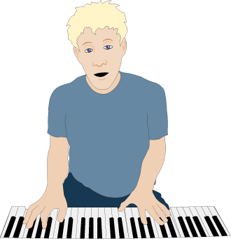
Keyboard Player
Some quick example text to build on the card title and make up the bulk of the card's content.
Go somewhere
Honey
Some quick example text to build on the card title and make up the bulk of the card's content.
Go somewhere